The Big 10 11 12 Ten revealed its new logo this morning.� The graphic, which must have�taken-at a minimum-three minutes of thought and effort, is�already being described as “awful”, “pathetic”, “confusing”, and “evoking the sheer futility inherent in all of man’s endeavors.”�� [ok, the last one is mine, but still]
We here at TRC decided to offer��our own considerable artistic energies to the Big Ten in the hope that a better logo can be developed.
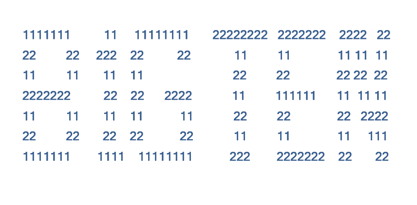
So, after the jump, we present you with the new,�New�Big Ten Logo.�� You’re�welcomed in advance, Big Ten:
/
/
/
/
/
/
